Arnold Ventures
I was responsible for the design and development of a webpage and data visualization to help site visitors understand Arnold Ventures through their grant data.
In this case study:
- Context
- Process: Research, design, development
- Takeaways

1. Context
Arnold Ventures is a philanthropy focusing on issues across health, education, criminal justice and public finance. I joined my team at Upstatement to focus on data visualization and help tell AV's story through data. Prior to my start, Upstatement led AV through a thorough rebrand and website redesign to help them better communicate their mission and values.
2. Process
Research
I learned to juggle a lot of requirements on this project: an emphasis on transparency, a desire for data humanism, and a clear presentation of AV's guiding principles. I led conversations with our client and spent a month exploring and understanding our data before diving into rounds of iteration.

Design
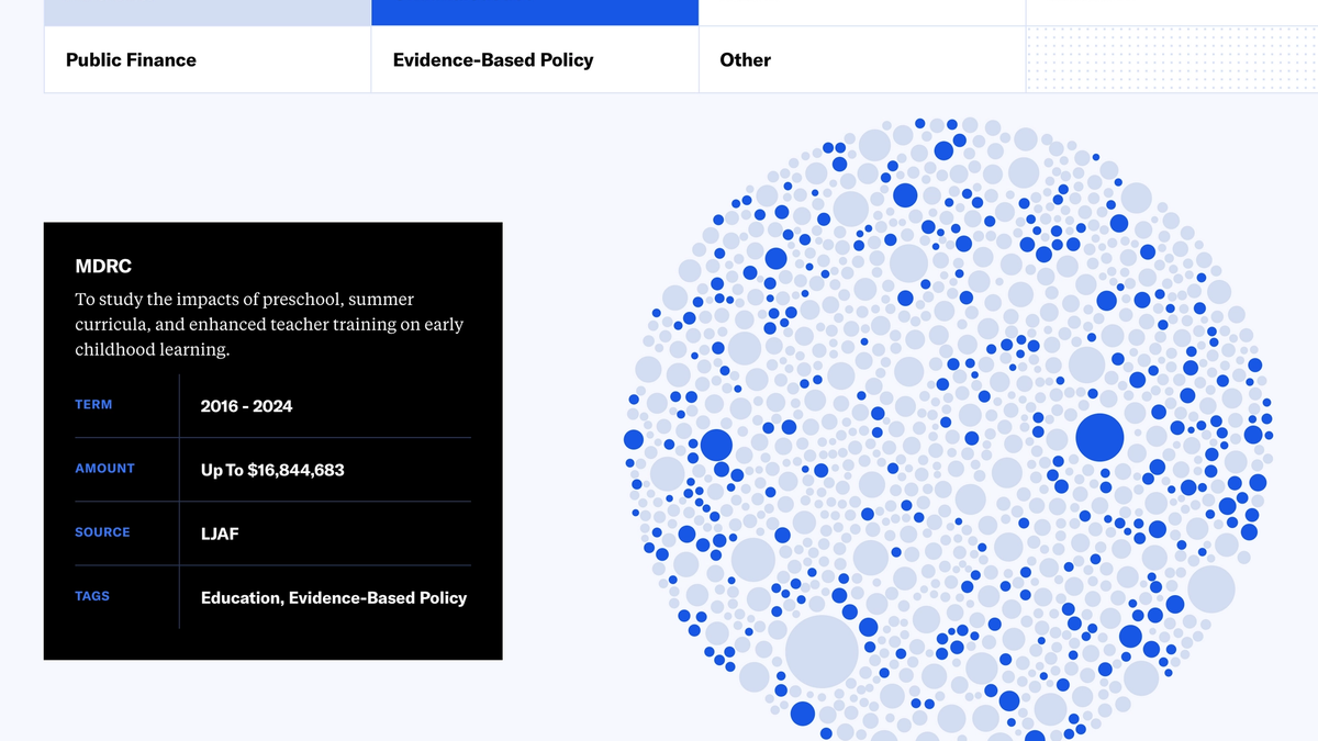
The page needed to serve a variety of purposes, one of which was to introduce Arnold Ventures to new users unfamiliar with the organization. At the same time, we wanted to create a tool that more familiar users could use to explore the data. The Knight Foundation and Fathom's work on Trends in Civic Tech was a big inspiration for me.
One of the overarching goals, however, was to emphasize the impact value of each grant rather than its monetary value. It was definitely an interesting challenge to solve — how to visualize data without the numbers.
Below are some designs that explored different ways of humanizing and highlighting the data to communicate AV's mission.


Development
This was my first time working with force layouts in D3, so there was a bit of a learning curve (and, I mean, it's D3 so that was expected). I gained some practice designing for data vis as well and spent a while working between Sketch and code while iterating.

Integrating the vis into the the site required some creativity and some plugins. The site runs on Craft CMS and it took some maneuvering to source the data from Craft to design for scalability — my favorite challenge of this project.
The idea of responsive data vis had totally slipped my mind and became both a headache and a huge learning opportunity. Scaling the bubble chart for various screen sizes but also designing to accommodate an evolving and growing data set, I had to consider the project's sustainability in the future after I transitioned off the team.
3. Takeaways
Strategy: How to manage a project, start to finish: defining scope, sorting through requirements, and working closely with stakeholders.
Design: Strike a balance between designing static mockups and rapid-prototyping in code (don't spend so much time copy-pasting circles in Sketch). Do NOT forget about how data vis will scale for changing screen sizes and changing data sets.
Development: Page performance, especially with lots of data, should be a top priority.
I owe a great deal to the amazing team I got to work with at Upstatement (Keri O'Brian, Jess Landre, Michael Pelletier and Camden Phalen) and our great friends on the Arnold Ventures team. A big thank you to everyone involved!
See the live site at arnoldventures.org/grants.